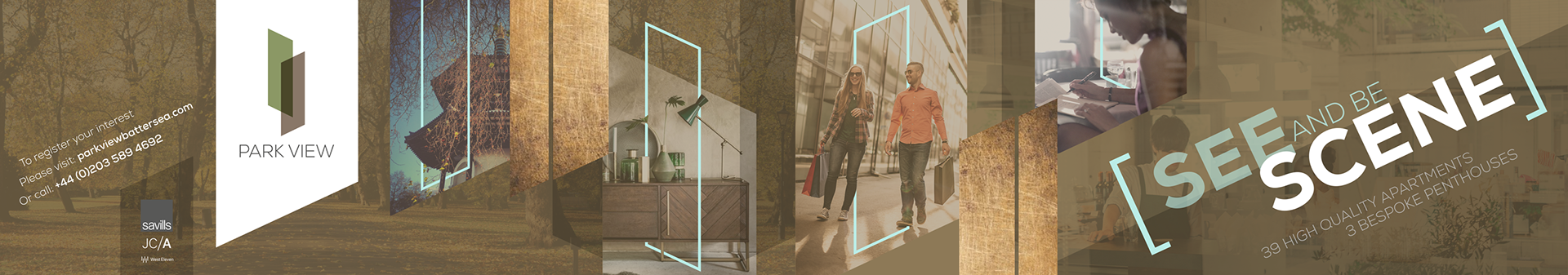
The brief for this job was to create promotional hoardings for a new high-end development in Battersea combining young people and the park itself.
The client wanted to emphasise the aspirational lifestyle of the potential buyers and the only assets supplied were the Park View logo and some images
of interiors from a style board done by the interior designer. This was basically brass objects and furniture and some colour swatches. This was a very fast turnaround project with the majority of the work done in one very busy day.
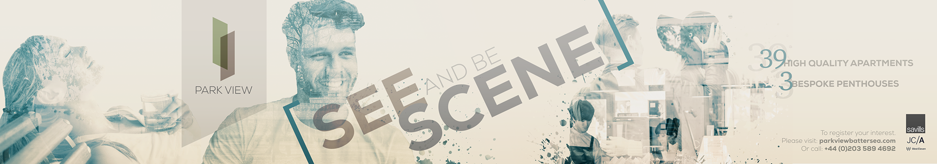
Route 1 - A bright and open layout with a youthful feel
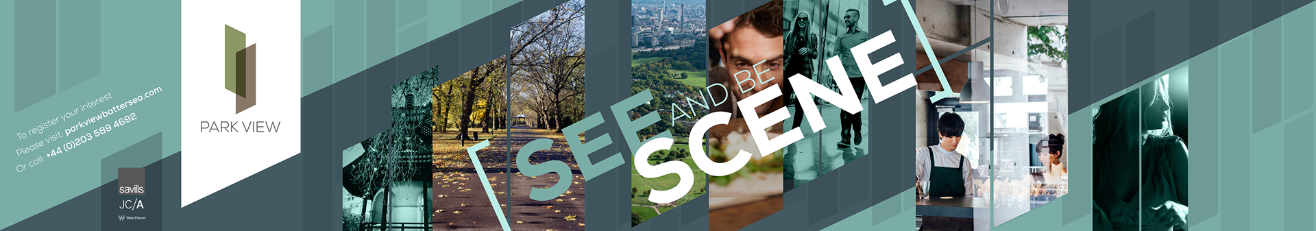
Route 2 - Using the logo's basic shapes as image holders and graphic blocks
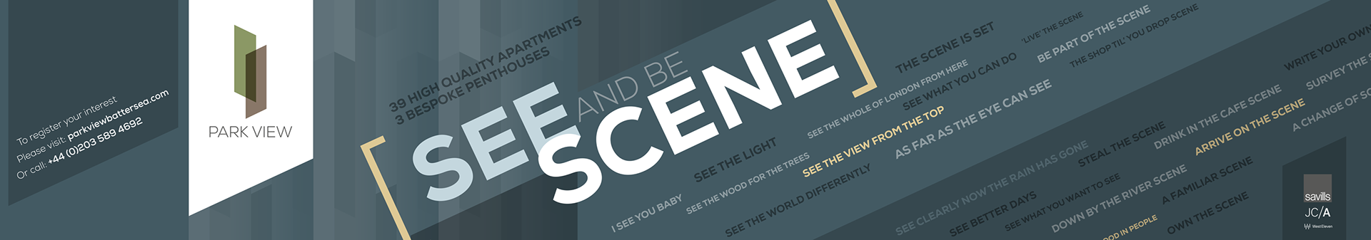
Route 3 - The typography as the hero and various copy lines incorporating the words 'See' and 'Scene'
Route 4 - Increasing the emphasis on lifestyle and the park itself while reducing the emphasis of the logotype.
Focuses a little more on the proposed interiors.
Focuses a little more on the proposed interiors.